STYLE GUIDE
Logos & Brand Guidelines
Downloads available below; just click the arrow below each logo.
Introduction
WheelHouse IT is dedicated to becoming the leading Managed IT Service Provider. In line with this dedication, we uphold meticulous standards in all aspects of brand representation and communication. The WheelHouse IT identity symbolizes our commitment to delivering top-notch products and services, driven by our team of passionate and dedicated professionals.
Key Guidelines:
- Utilize only one of the approved color versions of the logo.
- Avoid altering, rotating, modifying, or adding content to the logo.
- Adhere to the clear space guidance provided in the branding documentation.
- Refrain from using outdated logos unless directly referencing WheelHouse IT’s history justifies their use.
- Always write WheelHouse IT’s full company name as the following: WheelHouse IT
Overview
Our logo stands as the most straightforward, immediate, and identifiable embodiment of the WheelHouse IT brand. Rooted in our heritage, it conveys a sense of confidence, modernity, and renewed vigor, reflecting our forward trajectory. The cogwheel symbol and full logo communicate sincerity, respect, and clarity, encapsulating our core positioning.
Color Variations
“WheelHouse Blue” serves as the primary color expression for WheelHouse IT’s audiences. As an alternative, a secondary tier or accent may be utilized as background colors to complement WheelHouse Blue.
White typography should predominantly be employed on both primary and secondary colored backgrounds.
Note: Tertiary colors should be used sparingly and not applied as large fields of color.
Full-Color Logo
Full Color Logo w/ Tag (Light Background)
Full Color Logo w/o Tag (Light Background)
Full Color Logo w/ Tag (Dark Background)

Full Color Logo w/o Tag (Dark Background)

Symbol WIdget Logo


One-Color Logo
One Color Logo w/ Tag (Navy Blue)

One Color Logo w/o Tag (Navy Blue)

One Color Logo w/ Tag (Orange)

One Color Logo w/o Tag (Orange)

One Color Logo w/ Tag (White)

One Color Logo w/o Tag (White)
Seasonal Logo
Breast Cancer Awareness Month (October Only)

Pride Month (June Only)

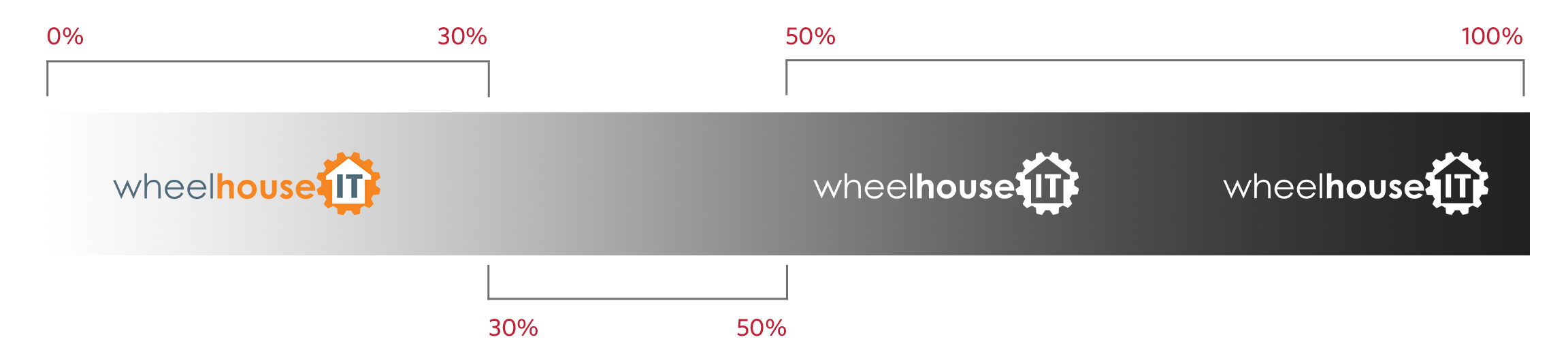
Background Contrast
Use the full-color logo when the background color value is between 0% and 30% after conversion to gray scale.
Do not place the logo on a background when the color value is between 30% and 50% after conversion to gray scale.
Use the reversed logo when the background color value is between 50% and 100% after conversion to gray scale.
Placement
The Wheelhouse IT logo must always be placed to the left or right margins of any given application. The logo can be positioned at the top right, top left, bottom right, or bottom left corners.
When placing the logo, ensure the minimum space for margins demonstrated is observed. “x” represents the cap-height of the Wheelhouse IT logotype (the COG symbol), and this is the minimum amount of space required left and right of the logo.
Additionally, it’s recommended to leave a larger amount of space (1.5x minimum) above or below the logo whenever possible.
Note: The Wheelhouse IT logo should be scaled in size to best suit specific communication and application needs.
Color Palette
“Wheelhouse Blue” serves as the primary color expression for Wheelhouse IT audiences. As an alternative, a secondary tier or accent may be utilized as background colors to complement Wheelhouse Blue.
White typography should predominantly be employed on both primary and secondary colored backgrounds.
Note: Tertiary colors should be used sparingly and not applied as large fields of color.
PRIMARY
#1B3C5A RGB (27, 60, 90)
SECONDARY
#516D7C RGB (81, 109, 124)
ACCENT
#F68420 RGB (246, 132, 32)
Periwinkle
#D2DBE6 RGB (210, 219, 230)
Light Gray
#F6F6F6 RGB (246, 246, 246)
White
#FFFFFF RGB (255, 255, 255)

Fonts
CENTURY GOTHIC
Used for logo.
CALIBRI
Used for standard communication.
OPEN SANS
Used for web content.
Interior Paint
(Office Locations)